

Icons in Flutter
Icons in Flutter: introduction
Icons in Flutter are displayed with the Icon widget from an IconData value, most often one of the bundled Icons (Material) or CupertinoIcons (iOS-style) sets, or a custom icon font added to the project.
Flutter provides a wide range of built-in icons, while custom icon fonts can be used when the default sets do not meet the application's design requirements.
Key facts at a glance
Icon(Icons.home)displays a Material icon;uses-material-design: trueinpubspec.yamlbundles the Material Icons font used by theIconsclass.CupertinoIconsships as part of a separate package,cupertino_icons, which is added underdependenciesinpubspec.yaml. It is independent ofuses-material-design, althoughflutter createadds both by default.- Custom icon fonts are declared in
pubspec.yamlin the same way as custom text fonts, and their glyphs can then be referenced usingIconDatainstances. Icon'scolorandsizeproperties style it directly; without an explicit color, it inherits from the nearestIconTheme.- Vector icon packages (like
flutter_svgfor arbitrary SVG assets) are a separate approach from font-based icons for cases a bundled icon set doesn't cover.
How do I configure an icon in Flutter?
Icon takes an IconData constant plus optional size and color.
import 'package:flutter/material.dart';

const Icon(
  Icons.favorite,
  color: Colors.red,
  size: 32,
);
Leaving color unset makes the icon inherit from the nearest IconTheme, which is how icons automatically pick up a consistent color from AppBar or BottomNavigationBar without setting it individually.
An Icon with no text next to it carries no meaning for screen readers by default - pass semanticsLabel when the icon is the only cue for what an action does:
const Icon(
  Icons.favorite,
  semanticsLabel: 'Add to favorites',
);
How do I add a custom icon font in Flutter?
Custom icon fonts are declared in pubspec.yaml similarly to custom text fonts. Individual icons are represented by IconData values, typically exposed as constants through a hand-written or generated icon class.
flutter:
  fonts:
    - family: MyIcons
      fonts:
        - asset: fonts/MyIcons.ttf
class MyIcons {
static const IconData logo = IconData(
0xe900,
fontFamily: 'MyIcons',
);
}
const Icon(MyIcons.logo);The hex code (0xe900) must match the codepoint assigned to that glyph in the icon font. Tools such as IcoMoon or FlutterIcon can generate the font file together with the corresponding Dart icon definitions, while the same definitions can also be written by hand.
Icon widget vs. Image asset
| Icon widget | flutter_launcher_icons |
|---|---|
Best for | |
| Symbols, UI icons, actions, status indicators | Logos, illustrations, photographs, detailed graphics |
Source | |
| IconData from Material, Cupertino, or a custom icon font | PNG, SVG, WebP, or other supported image formats |
Scaling | |
| Scales cleanly as a font glyph | Depends on the asset format; SVG scales without losing quality |
Coloring | |
| Easily controlled with color and IconTheme | Requires image-specific techniques such as SVG color handling or color filters |
Accessibility | |
| Supports semanticLabel directly | Requires appropriate semantic handling depending on how the image is used |
Typical example | |
| Icons.favorite, Icons.delete, Icons.settings | Company logo, product illustration, decorative image |
As a rule of thumb, use Icon for small, reusable UI symbols that behave like part of the interface, and use image assets when the graphic is a logo, illustration, photograph, or other artwork rather than a UI icon.
Best practices
- Rely on
IconThemefor consistent icon styling across a widget subtree instead of setting properties such ascolor,size, andopacityon every individualIcon. Override these properties locally only when an icon intentionally needs different styling. - Use a custom icon font for a small, consistent brand icon set. For standalone or highly detailed vector graphics, prefer an SVG asset with
flutter_svg. - Keep icon size and visual weight consistent with the surrounding UI, and ensure interactive icons have an appropriately sized tap target, especially when used inside components such as
IconButton. - Confirm codepoints match exactly between the icon font file and the
IconDataconstants referencing it. - Add
semanticLabelto a standaloneIconthat is not paired with visible text, so screen readers can communicate its purpose.
Common mistakes
- Hardcoding icon colors instead of using
IconThemewhen the icon should follow the surrounding theme. This can cause icons to look inconsistent when the screen's theme or context changes. - Mismatched codepoints between a custom icon font and its
IconDataconstants. This renders the wrong glyph, or a blank box, instead of the intended icon. - Reaching for a full SVG rendering package for a small, reusable icon set when a custom icon font would provide a simpler solution.
- Using an icon as the only visual cue for an action without providing a
semanticLabelor another accessible name. Screen readers may otherwise have no useful information about the icon's purpose. - Treating the icon's visual size as the tap target size. Interactive icons should have an appropriately sized hit area even when the glyph itself is smaller.
Learn more
Building a Design System in a Large Flutter App
Flutter is known for its seamless UI/UX features and robust design elements. It allowed us to deliver a unique customer experience in the “CA24 Mobile” banking app. This article shares some of the learnings and pain points behind implementing it in this large project.
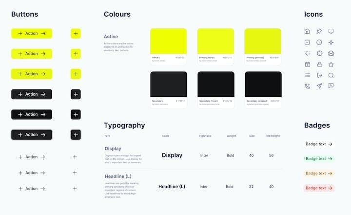
Benefits of a Design System in the AI Era: Why Your Digital Product Needs One
Building a new digital product, such as a web or mobile application, is complex. You need to map user stories - create a simple description of features - then apply them to the developers' scope of work and the app’s design. Discover how a design system can unleash efficiency, consistency, and scalability in your digital product.

Right to Left (RTL) in Flutter App - Developer's Guide
Find the most important things to keep in mind when introducing RTL design in your Flutter mobile app and how you can use Flutter to support various text directions with little effort. Follow the guide on RTL prepared by Flutter Developer.