
Benefits of a Design System: Why Your Digital Product Needs One


Building a new digital product, such as a web or mobile application, is complex. You need to map user stories - create a simple description of features - then apply them to the developers' scope of work and the app’s design. However, there is something that can speed up these two elements of product development - a design system. Interested? Keep reading.
Check out our Product Design workshop if you need help with the entire product design process.
What is a design system?
A design system is a set of guidelines, rules, and graphics elements called components used to create and develop coherent digital products. The design system aims not only to ensure consistency across all elements and processes within a product but also to speed up the work of designers and developers, eliminate errors, and serve as a single source of truth about the product. The design system also facilitates collaboration between different teams involved in the project.
Elements of the design system
The design system consists of essential rules regarding:
- Typography - includes font families, sizes, weights, line heights, and the way of using them in the designs. Consistency in typographic choices and guidelines ensures readability and establishes a cohesive visual language across the product.
- Colors - includes tones, shades, and contrast of colors with guidelines for their usage and combinations. A well-defined color palette helps to maintain visual harmony and consistency. Color code also allows users to identify the type of action that needs to be performed (success, neutral, or danger) or the importance of action (primary, secondary, tertiary).
- Spacing - defines the relationship between elements in the design system and includes guidelines regarding the distance between elements, their position on the grid, etc. This enhances visual harmony and coherence across different screens, layouts, and devices.
- UI elements such as buttons, inputs, icons, controls, text fields, menus, and cards - the design system defines the appearance and behavior of elements in different states, such as enabled, disabled, selected, danger, etc. Each element is assigned specific colors, fonts, and autolayout. This empowers product designers to apply individual components to the designs with the assurance that they will look and behave consistently across all screens.
- other graphic elements that may appear in the design process, including illustrations
In addition to individual components, the design system also defines an approach to responsiveness, the behavior of elements in case of error or success, and guidelines for creating more complex elements such as forms or navigation.
It can also contain information about motion, branding, or tone of voice - basically, everything related to visual identification and use is documented in one place. What significant benefits does this solution have at the very beginning of the project and in the long term?
9 design system benefits for your digital product
1. Design system as a programmable UX
When creating a design system, the designer acts as a micro developer. The designer creates system design elements according to the same methodology used by programmers during coding. One of the most popular methods of building components is called atomic design.
Atomic design involves building UI elements starting from the smallest unit, called an atom, such as an icon, button, or input field. Larger and more complicated elements composed of atoms are called molecules, examples of which include search inputs or cards. By combining molecules, designers can create even larger structures called organisms, which can contain multiple molecules. Finally, templates define the overall layout of the page.
Developers then translate the elements created by designers into code, following these design principles. Maintaining consistency between the visual appearance, behavior, and naming of these elements in both design and code is crucial during this stage. Therefore, collaboration between the design and development teams is highly important.
Implementing a programmable UX significantly speeds up developers’ work and ensures the overall consistency of the entire user interface. The design system provides common patterns for various teams, extending beyond designers, to follow.
2. The whole team on the same page
Thanks to the structure behind the consistent design system, it becomes a single source of truth for the entire team - both for the designer and developers and the product owner or the client himself. A design system is like a style guide.
Using consistent nomenclature and language makes it easier to find optimal solutions and work efficiently within the same document. This approach significantly improves product team collaboration and communication, streamlines the handoff process with developers and simplifies any necessary modifications, when it's necessary to change user interfaces, create components or custom elements.
Clear guidelines also greatly facilitate the tester's work on new features and simplify the onboarding process of a new developer in the team.
3. Faster development, fewer errors
Each element of the design system is prepared in a way to give developers clear guidelines on how to use a given element. They don't need to create solutions; they follow the design. As a result, each interface element has its source in the design system, thanks to which we minimize developer doubts, and we are sure that each repetitive action, such as error handling, toasts, or modals, will look and work in the same way.
If you would like to read more about the implementation of the design system in Flutter, read our article.
4. Consistent look and feel for the user
Consistency and repeatability are vital aspects the user expects when interacting with our product. When creating a user interface, we must strive to maintain a high level of consistency so that the users know exactly what to expect when in contact with our digital product. Design decisions should not be frequently changed unless they are not a result of user testing or changing business requirements. Each modification should be thoughtfully evaluated and effectively communicated to users.
Our product and UI components are then understandable and predictable not only for product teams but for the final user and thus pleasant and easy to use. Users are willing to return to such products and use them daily.
CONSISTENCY = USABILITY
5. Flexible approach to changes
Scrum projects are accomplished in an environment full of changes. Product owners and the design team often need to revise previously made design decisions due to the evolving business requirements and respond to feedback given by users.
Adaptive system design can hugely accelerate the change that needs to be implemented because it is done with the method of atomic design. Any global change can be done simply by changing the element only in its source. What does it mean? Thanks to this solution, in the blink of an eye, you can test how your product will look with a changed color, with increased button roundings, or increased inputs’ height.
There is no need to change mock-up by mockup anymore, which is very time-consuming, but to make a global change in the design system.
6. Cross-platform design solution
A well-prepared design system can be used on different platforms. We do not need to create separate components for Android, iOS, or web. A holistic view of our product and style guide results in consistent feelings and expectations of our customers and, thus, greater trust and a sense of security on each platform they use. Customers who interact with our product expect a consistent look and feel across all available platforms.
Common components also mean a common code, and thus reduced time for both the designer to prepare a feature for each platform and the developer to code this solution. It also speeds up the process of creating any design change and new components because we are sure that the element we want to change has only one source in the design and the code and not, for example, several visual equivalents made accidentally.
Of course, not every element needs to be shared cross-platform. We can use different elements if needed, but any difference should result from a conscious decision supported by specific needs, be carefully considered and documented in the design system. If we use different elements without clear reasons, e.g., different error messages or toasts on each platform, we will only cause frustration and uncertainty for the user.
7. Reusable components save time and money
Digital products are constantly evolving. It's worth taking these design efforts because, thanks to reusable existing components, the process of creating new mock-ups and iterations of the product, and - consequently - the development time is significantly shortened - which can also be a competitive advantage when you want to introduce new features.
All this is due to the consistency maintained from the beginning, both in the design system by the designer and in cooperation with the developer, for example, in terms of naming particular elements. The reusability of previously defined elements is the key to saving a huge amount of time and, thus also, money, especially in the long run while taking care of customer experience.
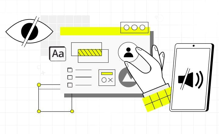
8. Supports accessibility of the product
Implementing a design system can also support the digital availability of the product, which is one of the elements we should take care of from the beginning when creating a digital product. People with disabilities are not only a marginal part of society, but in fact, more and more people struggle with permanent disabilities and temporary ones, e.g., when someone breaks an arm or forgets glasses and has much worse vision.
The designer can primarily take care of the appropriate contrast between elements, colors, and sizes of those elements. But not only. The design system should contain style guidelines for developers, such as determining the level of importance for elements, coherent information architecture, and consistent headings. Thanks to this, it will be much easier to use our product for visually or physically disabled people who use, for example, screen readers. Equally important are the alt attributes on all visual elements so that people who cannot see them know what is there.
The designer also cares about the responsiveness of the product and considers what the product looks like when someone increases the size to 200%, ensuring that all elements are visible and usable in the right way. Accessible forms, simple language, visible and legible hyperlinks, and even many types of visual hints, e.g., for people with color blindness, should also be taken care of.
Looking after accessibility does not have to be expensive if we are thinking about it from the beginning. And we must remember that every change towards people with disabilities is also a good change and facilitation for every other user. Each of us wants to achieve the goal through which we reach for an app in the simplest possible way.
Here you can find the article about essential web accessibility and how to lower the cost of its implementation.
9. Visual consistency beyond product
An experience with a product does not end with the development phase. Having a defined design system can be perceived as a design system documentation, which you can use to quickly create marketing and digital materials or even a landing page.
Teams working on the product or agency that will be made involved by the client can have access to the existing design system. That will determine the way of visual communication in each additional element created online or offline.
As a result, you increase product development efficiency, and the end user feels consistency in the application area and every other contact with the product. This allows them to easily associate, remember patterns, and recognize the application's branding while being outside of it.
The advantages of design systems: Conclusions
The design system is a key element that you should think about when you want to create a digital product. It gives us consistency of user interfaces, flexibility, and enhanced user experience, but also work efficiency, faster changes approach, fewer errors, and many more.
It isn't a good solution when you only create a quick proof of concept due to the considerable effort the designer must make to build the design system at the beginning of the project. However, for products in the MVP phase, where the development process takes more than a month, it is an investment that pays back very quickly. And most importantly, it generates profits in the future.
At our UI/UX design agency, we’ve created our own design system that you can benefit from when developing your web or mobile application with us. It can be easily adjusted to your product brand and features, which cuts the cost and time of development.
Need a design system that scales with your app?

FAQ: Learn more about design systems
Read more

Time-to-Market Optimization in Mobile App Development: Practical Strategies That Work
Mobile app development can feel like a race against time, especially in today’s highly competitive market. Between budget constraints, integration nightmares, and the ever-present pressure to innovate, getting your product to market quickly is a constant struggle. This article provides a practical roadmap for significantly reducing your mobile app's time-to-market.
Essential Accessibility: How to Lower the Cost of Building Accessible Web
Most digital products fail to address the rising needs of users with impairments. One of the reasons why business owners don’t decide to implement accessibility standards is a concern that it may raise the cost of web development. Read how to improve web and web app accessibility at a low cost.