
Building a Design System in a Large Flutter App


“CA24 Mobile” is the mobile banking app built with the Flutter framework for retail clients of Credit Agricole Bank Polska One of the crucial areas of developing this application was meeting the challenging UX requirements. Flutter is known for its seamless UI/UX features and robust design elements. So, in this case, it allowed for delivering a unique customer experience. This article shares some of the learnings and pain points behind implementing design systems in Flutter.
This article was originally published in our eBook, Building Mobile Banking Apps with Flutter. There, you can find even more content about the entire project.
Setting up a design system in a large Flutter project
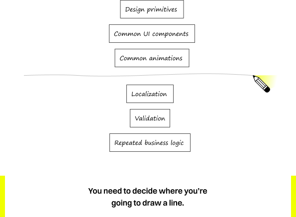
The design team should have already prepared the foundations of their design system at this point. The most primitive of which is a style guide that contains the very-very basic elements defined as design tokens such as:
- fonts used throughout the application,
- brand colors and styles for specific content,
- titles, captions or hints,
- and many other concepts that are defined at the very beginning and then reused as a variable – rather than hardcoded – in all components.
If you want to learn more about the basics and the benefits of design systems, read this article written by UX Designer.
The design team – from the Efigence company – used Figma for the CA24 Mobile app designs.
Those basics are reused in the Figma design file as well as in Flutter widgets. Deciding on how to define those styles must be well-thought-out. Well, all those 30 Flutter developers will use it later, right?
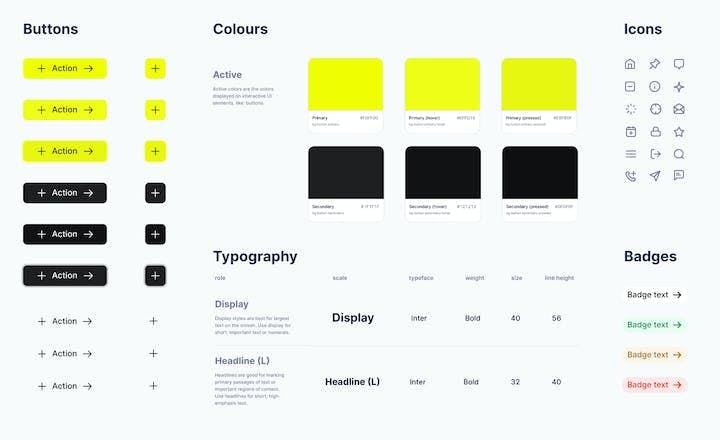
Colors. There are around 40 different colors in our style guide. All those colors come from Figma. They are validated in terms of contrast and brand compliance.
We created two structures that help use our defined colors.
A CAColor class, which is a child class of Flutter’s Color class. The only difference is that it has its constructor private so that only the cabp_common_ui can instantiate new colors.
final class CAColor extends Color {
  const CAColor._(super.value);
}
If you prefer, you could also use the @internal annotation from the meta package. The goal is to prevent developers from creating their own instances of the colors. They must use only our defined and approved ones.
The second structure is our color palette. A CAColorSchemeData class holds all instances of CAColor and is used by all other widgets or screens. It should be provided by an inherited widget, so widgets that use colors from this color scheme are rebuilt when it changes. For that, we also have a lerp static method, which helps when changing schemes.
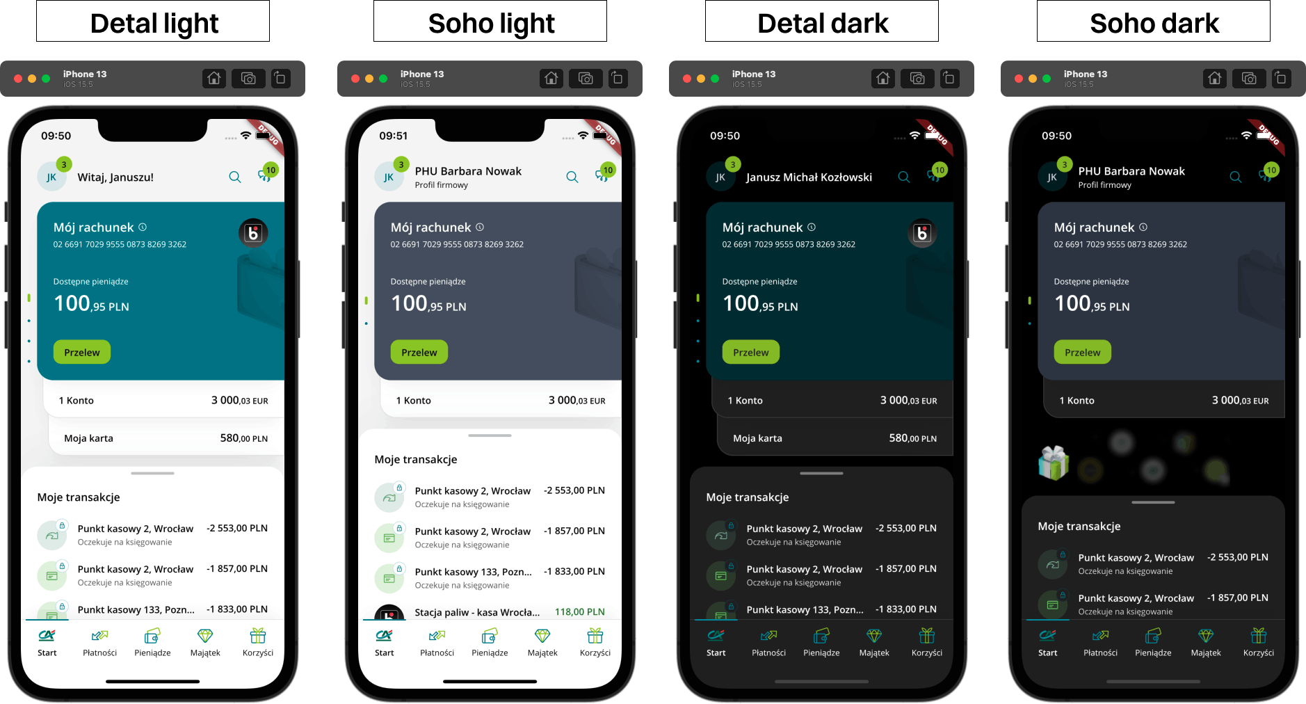
It is very handy in our case. The CA24 Mobile application has four color schemes: light & dark themes and those have a few differences between Detal & SOHO themes (which are fancy names for retail and business account themes).
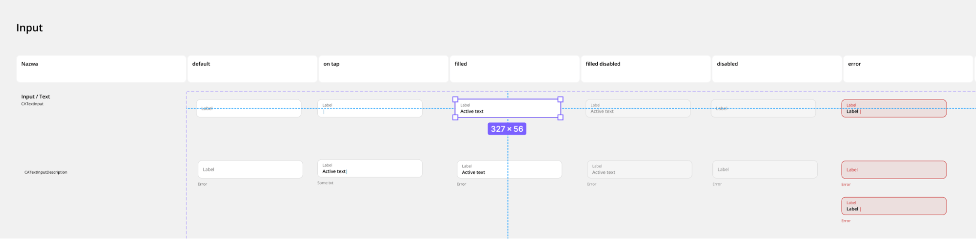
The second most important basic for us was text style. We also used a custom class for that purpose, making the constructor private.

The second most important basic for us was text style. We also used a custom class for that purpose, making the constructor private.
abstract final class CATextStyles {
  static const _fontFamily = 'Open Sans';
  static const headline1 = CATextStyle._(
    fontFamily: _fontFamily,
    fontSize: 24,
    height: 36,
    fontWeight: FontWeight.w600,
  );
  static const caption100 = CATextStyle._(
    fontFamily: _fontFamily,
    fontSize: 12,
    height: 18,
    fontWeight: FontWeight.w400,
  );
}
We found that keeping the text style and its color separate makes things much more manageable. The color usually isn’t strictly related to the text style, and it’s more convenient to have style and color parameters in CAText instead of using copyWith on style or other wild constructs. It has also enabled us only to accept our constrained types for text and other widgets:
class CAText extends StatefulWidget {
 CAText(
   String data, {
   super.key,
   this.style,
   this.color,
   this.textAlign,
   this.maxLines,
   this.semanticsLabel,
   this.scalingStrategy,
 })  : data = [CATextSpan(data)],
       assert(maxLines == null || maxLines > 0);
 final CATextStyle? style;
 final CAColor? color;
 // ...
}
Box shadows (which we call elevations), curves, durations, and map styles are solved similarly.
Design system in Flutter – Atomic Design
Once we have the basics set up, it’s time to create our first widget! The Flutter technology already gives us a collection of many customizable widgets.
From the most trivial ones like SizedBox, Container or Text to Material’s ContainedButton, AlertDialog or Scaffold.
Those widgets are put into another. Small parts are reused in more extensive pieces of UI. Brad Frost formalized the process of placing UI pieces together in a methodology better known as Atomic Design.

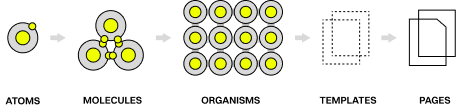
It’s a methodology of designing oriented around components, not whole screens. It defines how the minor independent parts – atoms – are built and reused in other places, such as molecules. It can be a simple thing like an icon that we always put on a small circular background.
A molecule is a group of UI elements that together can deliver some data to the user and simply add purpose to a screen fragment. We have a card where we put a title next to that icon and add some border and box-shadow around it.
Organisms group molecules together, creating fully-meaningful parts of the user interface. If you see an organism somewhere, it will be entirely understandable and function as a container with some context that you can safely put next to other “contexts,” like a carousel of mentioned cards with a heading and a close icon on a bottom sheet. If we put it on top of anything, it will still be visually understandable to the user.

Templates help glue everything together. Pages are simply… screens.
I highly recommend reading more about the methodology in “Atomic Design” by Brad Frost, a free online ebook.
The Overall Design squad was developing mainly atoms and molecules, but there were also some complex organisms and templates.
Design system in Flutter – Ambiguity
One of the biggest pain points was the frustration when different people had different ideas on how something should work. Naturally, developers came to designers with questions regarding components they develop.
Be it how something should behave in certain conditions, what should be clickable in this and that edge case, and how those parts should animate on the screen.
We usually called each other for ad-hoc calls and discussed that. The problems arose when some time had passed, and others started asking questions about why something works that way and not the other.
Those small decisions led to scratching our heads, searching through conversations with designers on Teams, or revisiting Git history for that component to remind ourselves why we introduced such a change in the first place.
At some point, it became a frustration that needed to be addressed ASAP. From then on, we always update the specifications on Figma or documentation in code straight away so that all knowledge and changes with their motives persist.
On a higher level, this is known as Architecture Decision Log.
Design system in Flutter – Future-proofing
During the implementation of this common UI library, there were a few situations where we were worried that we would need to rewrite many components because of some changes.
That was the case when we were introducing drastic changes to how the increased text scale accessibility feature was influencing our components or when there were other changes to how everything should animate with the finger gestures on our custom scaffolds.
You can't see some of those changes, but preparing for some of them is possible.
When we were first developing more complex organisms, there was no motion design prepared at that point, unfortunately. If we completely ignored the transitions when changing the currently selected tab in the tab bar or carousel physics, adding them later would be a refactor. It would cost us not only the time needed for introducing changes in the widget but also the time wasted in migrating all of the code that already used it.
The same principle applies when introducing new variants to components. Let's say you have a card that, until now, had only one style. The designer prepared another state for this card. Let's say that's a card that describes a debit bank card. The new state is for a case when a bank blocks the card. You can add a boolean blocked parameter to that card or introduce an enum that describes its states, like normal, blocked, and probably some other like shipped or expired in the future.
The dark mode was one of the things we knew we'd be implementing at some point in the future, but we didn't have anything close to its specification. If we did not create this construct of color schemes mentioned at the beginning of the article, we would spend a horrendous amount of time replacing all colors with their dark mode counterparts. It paid itself back doubly when we had to introduce another dimension of color themes (retail/business account).
The most recent challenge we encountered was fixing the application's appearance with an increased text scale. You'd be surprised how many people reported issues related to that. Thankfully, all text content, labels, and paragraphs in the app used our custom CAText widget. So we could address the vast majority of those issues by remapping how Flutter's text scale factor influenced font size and its line-height, as we agreed with the design team.
Think ahead. It saves time and helps you stay sane.
Design system in Flutter – Navigation
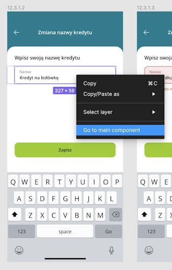
Other developers develop screens using our UI components based on Figma designs. Figma allows navigating to component definitions from their instances conveniently. There, developers are welcomed with all available variants for a component, its specifications, and its Flutter widget name, which they can use straight away in their Dart code.
Or, in other cases – an enum value, a named constructor, a few class names, or a widget’s name with some parameter value. Whatever a developer needs to use the component.


Developers from the Overall Design squad sometimes need to investigate how and why a component is used in a certain way. It generally comes down to finding the screen's source code, using Flutter Inspector, or searching for localized strings on a screen. Ideally, all screens have a one-line comment on top of their class that describes where this screen could be found in Figma.
We have so many screens and designs that we have over a dozen Figma files for different squads with all screens numbered, so it's easy to give a file's name and the screen number to find it. It saves you the hassle of asking the developer or designer for directions when you can't find the design yourself.
Design system in Flutter – Storybook
If we were to name one thing that improved our productivity in the project the most, we would scream storybook without a second of thought.

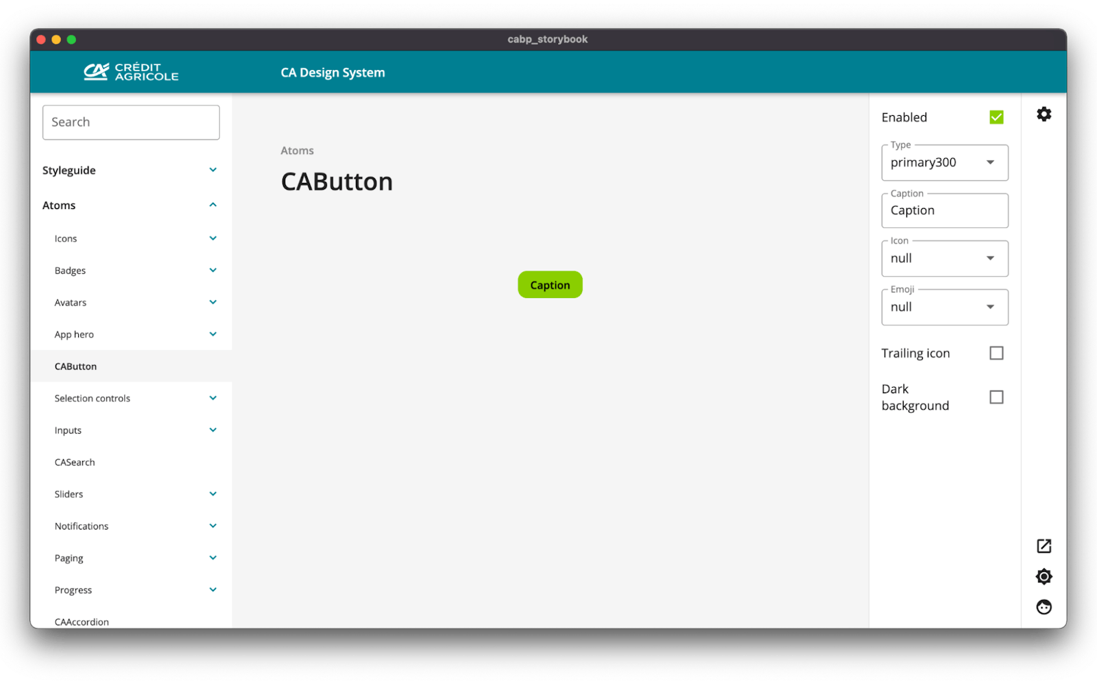
It serves:
- The Overall Design squad of developers as our magic workplace. We develop widgets in isolation and check all edge cases, strings of different lengths, states, and parameter toggle straight away without needing to sign in to the application. We don't have to wait for the emulator/simulator to boot or click through complex processes to reach this specific widget in a chosen state. It's also much quicker to compile and launch the desktop storybook application than wait for the mobile one. It's just faster.
- Other developers as a place to explore widgets before putting them inside a screen, checking if it suffices their needs even without writing code and hot reloading the app.
- Hosted on the Web as a place to display increments on Sprint Reviews, where we can open each new or modified component in a new tab and simply go through all of them prepared.
- As an environment to validate the components by the designers if everything looks and works correctly, as they wanted.
- Everyone else. Product Owners – they need to know whether a component is already developed or not to plan their squad's sprint more effectively. Social media people – they can set up and screenshot a card component with the travel credit information for their vacation marketing campaign.

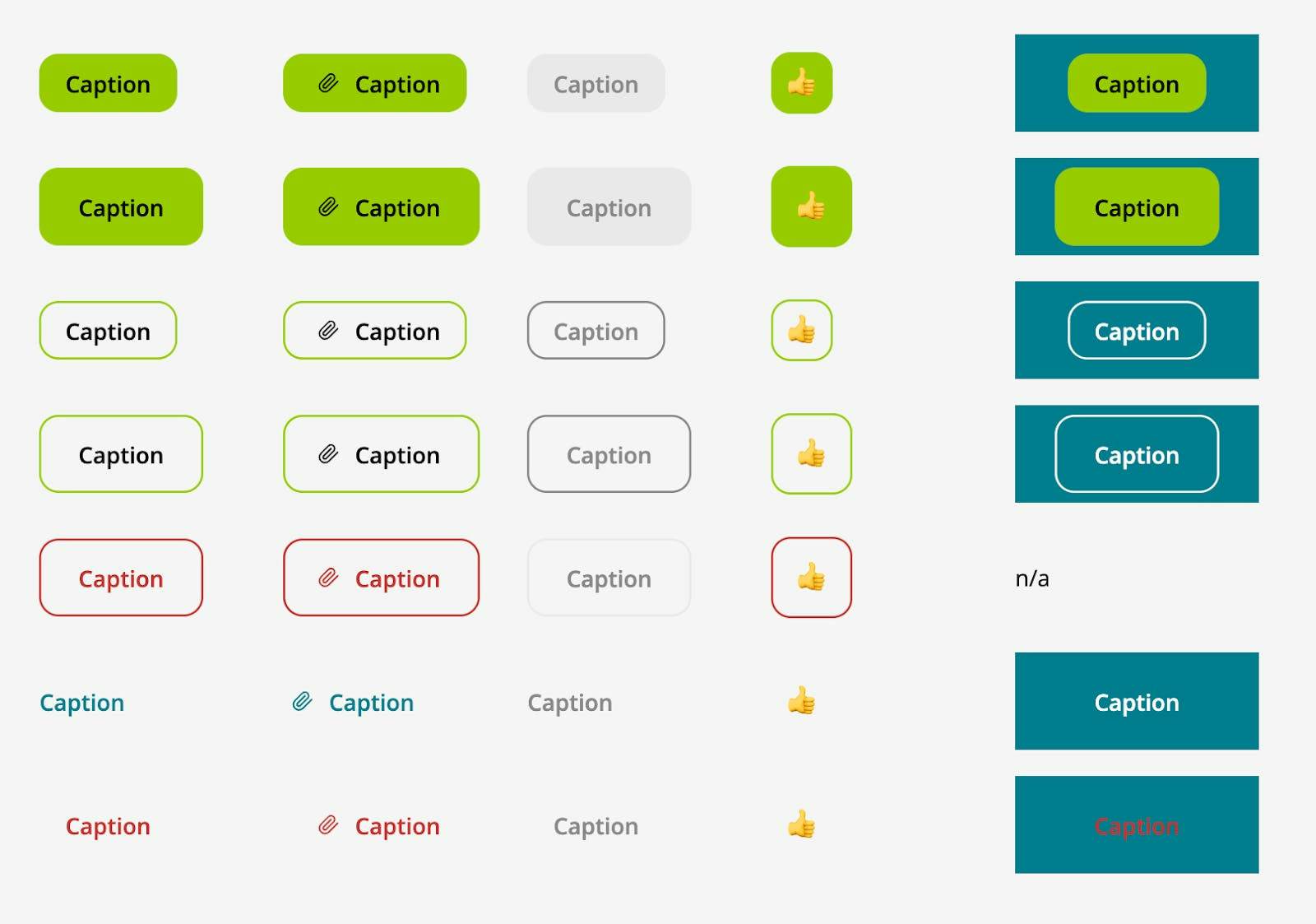
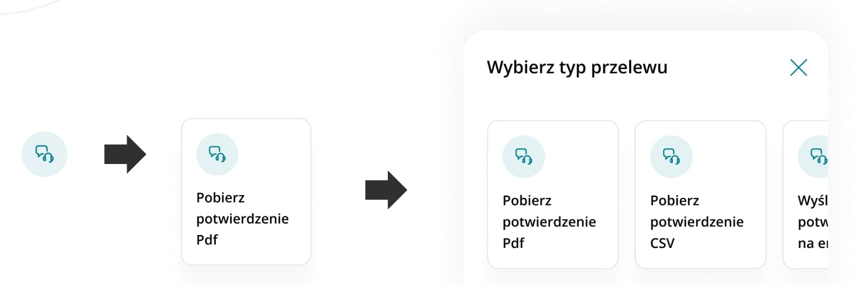
All those buttons are easily accessible through the storybook via its knobs. Do you want to see how a button looks in different sizes? Different type? With a leading icon? With a trailing one? On dark background? Sure thing! Adjust the knobs in the sidebar, and you’re good to go!
Design system in Flutter – Communication
Being the code owner of a package used by everyone else makes you hold and create knowledge that needs to be shared with other developers.
When it is information that is crucial at the moment – an announcement of a new component that some squads were awaiting or a deprecation notice with some hints on what to replace the component with – we were using a simple means of a message on our dedicated Teams channel for Common UI announcements. It was marked as important, so everyone got this annoying push notification and wouldn’t miss the news.

We used Markdown documents in the repository for higher-level documentation and other communications that should stay in some place and be accessed when necessary. It is where we store steps necessary for newly onboarded developers or people who need to use some part of the framework or shared functionality for the first time.
It is a place with help not specifically on how something works but on what component or solution to choose and why when designing screens and business logic.
Apart from the developer-developer communication, as the Overall Design’s developers, we also had the developer-designer one. Creating consistency in the app was important. There were three significant learnings for us:
- Formalizing each decision, as mentioned in Ambiguity.
- Process of receiving updates from designers.
A vast part of our daily work was developing components our designers had designed. Or we were updating the already created ones. But we need to be notified of those components that have changed. It is something that would usually be resolved simply by using the JIRA board, where designers drop a tile concerning their component onto the next column on a board where we notice it and begin to work on it. For security reasons, designers could not access the JIRA back then, so we made our Kanban board in Figma.
- Components’ changelog would be very handy.
Sadly Figma doesn’t support something like that, and we didn’t maintain such changelogs by hand. Figma does indeed have file revisions history, but it’s the specific component’s changes that we usually wanted to check, not the whole file.
Design system in Flutter – Responsibility
What is the responsibility of the Overall Design squad? It needs to be decided before developing any of design systems. Clear code ownership is crucial for maintaining such a big codebase. Otherwise, the code without clear ownership will be lost.
Here are some of the things you may wish to be responsible for as a squad or not:

Design system in Flutter – Technical challenges
During the development, we stumbled upon many small and big challenges. The first significant decision involved choosing the correct tool for a storybook. As you already know, the outcome was relatively successful.
When we had this dilemma, there were only two open-source players on pub available – storybook_flutter and dashbook. After doing some research and creating an MVP, we decided to go with `storybook_flutter.` Later, we refactored it to accommodate our requirements, such as a tree structure for the components, two theme dimensions, and Credit Agricole branding.
At the moment of writing, two more solutions are available: widgetbook and flutterbook, both of which seem promising.
Today (June 2023), I’d recommend going with Widgetbook, as it’s probably the most advanced of them all and offers all the features we needed to implement ourselves. They also offer some collaboration tools if you go with their cloud-based solution.
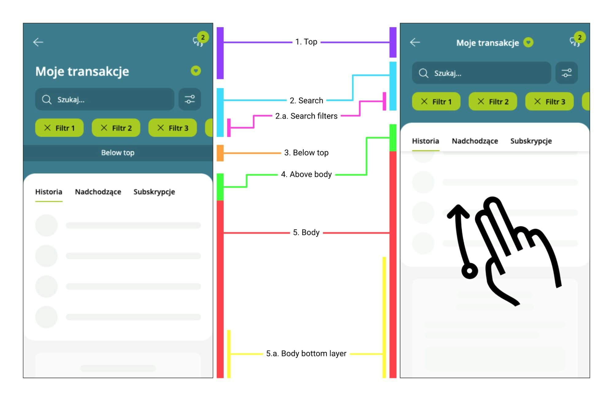
The application's biggest and most complex component is the root bottom drawer located on the start page, below the accordion and benefits river, connected to the screen it shows when expanding. When you play with the application, you can see how the drag gesture slowly reveals the second screen, which is a separate route.
Apart from that, on this second screen, you can scroll the page, typical behavior, with the header elements folding themselves with the paging zip on the side. When you focus on the search bar, it also animates itself to the app bar. And if you happen to be on top of the page, you may drag the body down to collapse the drawer from the start page.
Trivial stuff, eh? No. The first iteration of this artifact took 2 weeks, heavy research, and deep-diving into the internals of scrolling, gestures, and routes.
Looking inside DraggableScrollableSheet was very helpful, as it did more or less the same things, just a magnitude of complexity lesser. But after the design team reiterated and reiterated more on how this screen should behave, the following updates were harder and harder to introduce until, at some point, we finally couldn’t introduce the change as the code was such an incomprehensible mess.
It was a time for a clean and thought-out refactor. We started by drawing all available states on paper and laying them out on the floor to find how each state relates to the others. Then we knew what we were dealing with. We could start by looking for the correct math for concrete translations and applying them.

On the contrary, we also had some minor technical problems. One of them was the VisualDensity in a few of the Material components we used, like TextField and TextButton. At first, we didn’t notice it. Still, the buttons on the mobile were bigger than on the desktop – in the storybook. Once we found the problem, it was a quick override in those widgets, and voila!
This project was a huge opportunity to dive into some Flutter internals. Some of the other things we dove into were inputs, input decorators, and the backend connecting Flutter with native input logic. Dropdowns, how they work, and how they use CompositedTransformFollowers and Targets. Scaffolds with all their insets. Routes, how they animate and handle popping, Overlay.


Summary
Squad 01: Overall Design coordinated the design system's development. Initially, this task was hardly trivial because even with the Atomic Design approach, during the development process, we had to quickly decide about the final shape of the main Molecules and the Organisms our app was built. We kept growing our library of fully developed components with every sprint. That was one of the most significant benefits of Flutter as a cross-platform technology: we could have just one instance of each component in our own design system.

Read more
Benefits of a Design System: Why Your Digital Product Needs One
Building a new digital product, such as a web or mobile application, is complex. You need to map user stories - create a simple description of features - then apply them to the developers' scope of work and the app’s design. Discover how a design system can unleash efficiency, consistency, and scalability in your digital product.

Flutter Add to App - Overview and Challenges Based on Real-Life Case
Flutter has taken the mobile market by storm, but not everybody knows that you don’t always have to write a Flutter app from scratch. It can be integrated into your existing application piecemeal. Read more about the Flutter add to app feature.

Banking Apps With Flutter? The Overview and Opinions
The number of banks that have opted for Flutter is growing. Specialists from three banks interviewed - Nubank, ING Silesian Bank, and Credit Agricole Bank Polska - rated Flutter as a 9 (out of 10 point scale). Find out if Flutter really is the right solution for building banking apps.