
Connectivity Is Not a Given: Offline Mobile App Design

How to design mobile apps when faced with poor connectivity, offline mode, and error handling.
When creating mobile applications, we often assume they’ll operate under ideal conditions—with stable internet connections, fast servers, and smooth data flow. In reality, users frequently face issues such as connectivity loss, slow data loading, or server errors. These problems aren't just technical challenges; they also cause user frustration, potentially leading users to abandon the app. How, then, should we design applications that remain intuitive and functional even with limited connectivity?
Key UX Challenges
- No Internet connection
A lack of connectivity or the inability to retrieve data often renders the app useless. Users may become frustrated, especially during critical operations like payment processing. Implementing partial offline functionality and clearly communicating connection status or synchronization issues can significantly improve the user experience. - Slow connection
Slow or inconsistent data loading disrupts user flow, causing frustration and task abandonment. Introducing incremental loading techniques and organizing content delivery ensures users get quick access to essential information. - Unexpected errors
Vague error messages without clear next steps can leave users feeling lost. Effective UX practices include clear, actionable error messages with guidance on resolving the issue. - Limited resources
Device storage constraints, synchronization failures, or insufficient system resources can prevent data access, often without clear explanations. Apps should allow users to optimize stored data, remove outdated content, and manage device storage efficiently.
Well-designed applications not only handle connectivity problems but also proactively anticipate and minimize their impact on users.
Strategies to improve UX
1. Understand your application
A thorough understanding of your app’s structure, functionality, and purpose is key to maintaining good usability, especially under challenging network conditions. When analyzing the information architecture, prioritize essential content and tasks. Clearly define the following:
- Where does on-screen data originate? (Is it fetched from the server upon each request or loaded from a local cache? How many requests does the app make?)
- Which components can or should operate offline?
- Which parts of the interface can function independently of the rest?
- Which elements and features are most crucial from the user's perspective? What does the user flow look like?
- Where could potential errors occur? (e.g., issues in data flow, disruptions in critical tasks due to synchronization errors.)
- Where and under what circumstances will users primarily use the app?
Equally important is understanding user personas. Will your app be used in environments with limited connectivity, such as construction sites, mountain rescue operations, or remote travel scenarios? In these cases, different approaches to data storage, synchronization, and content presentation are necessary. Offline functionality should ensure that users always have access to essential features, even with poor or no connectivity.
Only through deep analysis can optimal UX decisions be made, benefiting both users and the app itself.
2. Progressive enhancement – prioritizing core functionality
This approach ensures core functionalities are always accessible, regardless of connectivity quality. More advanced features become available as the connection improves. Users never completely lose access to the app, even under challenging technical conditions.
Examples of progressive enhancement:
- Credit Agricole Mobile Banking App: Priority is given to displaying the account balance while the remaining part of the interface is being loaded in the background. As a result, this app won the time-to-money category for Polish banking apps for 2024, for being the quickest to display the most in-demand information for the user, proving the high performance of both the design and the underlying Flutter engine.
- Google Maps: Google Maps employs progressive enhancement by first loading essential map data and basic navigation features, ensuring usability even under limited connectivity. As connection quality improves, advanced functionalities—such as detailed place information, live traffic updates, interactive street views, and richer visual layers—become seamlessly available, progressively enriching the user's experience.


- WhatsApp and Messenger: WhatsApp and Messenger implement progressive enhancement by caching recent conversations locally, enabling users to view messages, compose new ones offline, and clearly track their delivery status (sent, unsent, read). Messages composed offline are queued locally and delivered automatically upon reconnection. Enhanced functionalities, such as loading older conversations or media files, become accessible seamlessly as network connectivity improves.
Progressive enhancement emphasizes designing from the minimal viable version (always functional) toward a full-featured version, optimizing core usability and ensuring functionality even when offline.
3. Progressive loading – gradual content delivery
Progressive loading involves gradually loading content and data within an app, prioritizing essential visual elements and information to enable immediate user interaction. Less critical details and higher-quality assets load progressively in the background, minimizing perceived waiting time and creating an impression of faster performance regardless of actual network conditions. Effective progressive loading requires clear content prioritization, visual placeholders, and carefully planned content hierarchy.
Examples of progressive loading:
- YouTube: YouTube uses progressive loading by prioritizing video playback at lower resolutions, ensuring immediate viewing without delays. Higher-quality streams, comments, recommendations, and thumbnails load gradually in the background, enhancing the experience seamlessly as connectivity improves.
- Facebook: Users can start reading and scrolling through feeds before multimedia and comments fully load.
- Pinterest: Pinterest utilizes progressive loading by first presenting low-resolution placeholders or blurred previews of images, enabling users to quickly browse content. Higher-quality images and additional details, such as descriptions, metadata, or related pins, load progressively as connectivity improves, enhancing the browsing experience without interruptions.
- Instagram: Low-quality placeholders or blurred previews of images and stories are initially loaded for immediate interaction. As the user scrolls or pauses, high-resolution images, videos, stories, and interactive elements (like comments or reactions) progressively load in the background, smoothly enhancing the user experience as connectivity stabilizes.
Techniques for enhancing UX during loading:
- Skeleton screens: Placeholder outlines indicating content layout instead of blank screens. Used, e.g., in Airbnb or YouTube, where the user can see what type of content is expected on the page while waiting for a better connection.
- Lazy loading: Multimedia content loads only when scrolled into view.
- Interactive loading: Allows users immediate interaction with the available content (e.g., video playback before the full page loads).


Progressive loading prioritizes speed, supports quick interaction, and minimizes perceived waiting times.
4. Resource optimization and clear content structure
To effectively implement the strategies described above, optimizing app resources is crucial. Large files—particularly images and videos—can significantly increase loading times, especially under poor connectivity conditions.
- Image and video compression:
Use formats like WebP instead of JPEG or PNG to reduce file sizes by around 25% while maintaining high quality. - Lazy loading:
Load images and videos only when they enter the user’s visible viewport, significantly improving initial load times. - Code and resource optimization:
Minimize the overall loading time by removing unnecessary code and assets.
Additionally, maintaining readability and clear content hierarchy enhances UX regardless of connection quality:
- Clear headings:
Allow users to quickly find key information. Prioritize loading these headings first. - Avoiding "walls of text":
Break up content into short paragraphs, use bullet points, and clearly highlight essential information. - User-friendly typography:
Choose appropriate font sizes and ensure a strong contrast between text and background for optimal readability.
5. Leveraging cache and local data – a strategic approach
Improving UX/UI Design in conditions of poor or no connectivity requires the strategic use of local storage and caching. To ensure a seamless user experience, consider the following:
Which data should always be locally available, and why?
Critical data or data that rarely changes should always be stored locally to facilitate essential navigation and access to key features, even when offline. For instance, menu headers, product categories, or main navigation tabs should remain available locally, avoiding frustrating "empty states".
Which data should remain cached locally after initial loading?
Content previously viewed by users should remain locally cached. This ensures users can return to previously accessed screens without losing data, even when offline. Apps like Airbnb or Amazon retain previously viewed images and prices, preventing empty screens upon revisiting products or offers.
Which data is essential locally to enable key offline functionalities?
Not only data must be stored offline, but also paths to access this data. For example, YouTube stores both the downloaded videos and the interface required to access and play these videos offline, ensuring smooth functionality without connectivity.
Answering these questions creates a coherent, smooth, and user-friendly offline experience, reducing frustration and significantly enhancing overall UX.
Examples of local data usage:
- Airbnb: Displays navigation headers and categories consistently. Even after losing connection, previously viewed content remains available locally, allowing quick revisits without empty screens.
- Zalando: Categories and previously browsed products remain cached locally, simplifying navigation and encouraging continued use despite temporary connectivity loss.
- Google Drive / Dropbox: A local file list is maintained, allowing users to browse and edit previously downloaded documents offline. Automatic synchronization occurs upon reconnection, clearly communicating offline status to users.
- Biedronka app: The loyalty card ("Moja Biedronka") remains accessible offline as a locally stored key functionality, ensuring continuous availability independent of network conditions.


Displaying outdated content with clear indications:
When displaying potentially outdated data, always clearly inform users. Even partially outdated data can provide users with context or preliminary information, enabling initial decisions without requiring immediate connectivity.
Examples of displaying outdated content:
- Google Docs: Users can view and edit documents offline, with synchronization resuming automatically upon reconnection, accompanied by a clear synchronization status message.
- Weather apps: Last available forecasts remain visible with clear indications that the information might be outdated, prompting users to refresh upon reconnection.
- Slack: Slack displays previously loaded messages when offline, clearly marking the interface with indicators such as "offline" or "trying to reconnect," ensuring users know they're viewing cached content and that updates will resume once connectivity is restored.
Strategically using cached and local data ensures apps remain functional and reduces frustration, significantly enhancing UX—particularly for mobile apps used in field conditions.
6. Offline mode – ensuring seamless app usage
When designing an app with offline mode in mind, it's essential to consider two distinct scenarios: dedicated offline features (an offline-first approach) for planned offline use, and fallback strategies for unexpected connectivity disruptions.
Offline support isn't only about addressing weak connections—some apps are explicitly designed for environments with limited or no connectivity, such as those used by construction teams, rescue workers, or travelers. In these cases, providing reliable access to critical functionality, seamless data synchronization, and efficient conflict resolution upon reconnection is crucial, making early consideration of offline capabilities a key part of the app development process.
Dedicated offline features (offline-first approach)
For users regularly working in environments with limited or no connectivity—such as construction teams, rescue workers, field sales personnel, or expedition members—it's essential to design specialized offline features that guarantee consistent access to critical functionalities, regardless of network availability.
Examples:
- Field service apps (e.g., construction, maintenance):
Technical documentation, reports, client data, and forms stored locally to ensure continuous operation without connectivity. - Google Maps:
Allows users to proactively download maps for navigation in areas without internet access. - Spotify / YouTube Music / AudioBible:
Users download playlists for offline playback during flights or long drives. - Netflix / Disney+:
Movies and series can be downloaded ahead of time for offline viewing during travel. - Google Translate (downloading dictionaries to translate):
Users can download specific language packs in advance, enabling real-time translations without an internet connection. This feature is especially useful for travelers, field researchers, or emergency responders operating in remote or foreign environments, ensuring communication remains possible even when connectivity is unavailable. - Wallets (Apple, Google):
Mobile wallet apps such as Apple Wallet and Google Pay store digital copies of essential documents—like boarding passes, event tickets, loyalty cards, and payment cards—locally on the device. This allows users to access critical information and complete transactions even when offline, such as during air travel, events with poor connectivity, or transit scenarios like underground transportation.


Fallback strategies for unexpected offline scenarios
Apps should also handle unplanned connectivity disruptions gracefully, enabling users to continue their tasks in a limited but uninterrupted manner, minimizing frustration.
Examples of effective strategies:
- Local queuing and automatic synchronization:
Users perform actions offline, which synchronize automatically once the connection is restored.
- WhatsApp / Messenger: Offline messages queue locally and are automatically sent upon reconnection.
- Google Docs: Offline edits sync automatically when the internet connection resumes.
- Business applications (CRM, sales): Meeting reports or offline orders synchronize automatically after reconnection.
- Clear offline status indicators:
Clearly inform users they're offline, e.g., “You are offline. Some features may be limited or unavailable.” - Intelligent storage management:
Automatically removes outdated offline data and provides manual storage management options. - Manual synchronization option:
Allows users to trigger data synchronization manually once connectivity is re-established. - Conflict resolution mechanisms:
Strategies for managing data conflicts when multiple users edit content simultaneously offline, including automatic conflict resolution, version control, user-based priorities, or manual conflict management.
Of course, for apps primarily designed for offline use, it's especially important to carefully plan for scenarios such as synchronization, conflict resolution, and local storage management, as these cases will occur frequently and significantly impact the daily user experience.
A well-designed offline mode ensures comfortable, efficient, and frustration-free app use. Clear offline indicators, smart local data management, automatic synchronization, and robust conflict resolution significantly enhance the user experience, especially in field-based or travel-oriented applications.
7. Keep users informed about what's happening
Good UX under poor connectivity conditions isn’t just about technical solutions; it also involves clear communication with users. A lack of information can leave users frustrated and uncertain. They should always know:
- Is the app loading, or has it frozen?
- Has an error occurred, and if so, what can be done?
- Is poor connectivity affecting the app’s functionality?
Communicating long loading times:
Clearly indicate prolonged loading times to manage user expectations. Use informative messages like "Loading is taking longer than usual. Please check your internet connection." You can also use animated skeleton screens to show that content is still loading.
In some cases, longer loading times are expected, such as when retrieving complex search results. To reassure users, additional messaging under the loader can help set expectations, e.g., "We're searching thoroughly—this may take a moment."may take a moment." or "Fetching the best results for you—thanks for your patience!"
Clear error messages:
Users should receive clear, actionable error messages that explain the issue in an understandable way, avoiding generic errors like “Error occurred”. They should know if there’s something they can do to resolve the problem (with a clear CTA), e.g., "Unable to load data. Check your connection and try again", or if the issue is beyond their control, such as a server or database error.
Offline mode notifications: Clearly indicate when the user is offline and provide information on whether any actions can still be performed. Example: Gmail notifies users they’re offline but allows them to compose emails, which are sent automatically upon reconnection.
Actionable suggestions for users:
- "Retry loading" – Enables users to refresh content immediately. Remember to also add pull-to-refresh functionality.
- "Connect to Wi-Fi" – Suggests switching connections if cellular data is weak.
- "View previously saved data" – Offers access to cached information offline.
Effective error handling techniques:
- Snackbars for minor issues: Short, non-blocking notifications that inform users without interrupting their experience. For example, Zalando displays a snackbar: "Internet connection lost", but allows users to browse already loaded data even when they tap a different tab in the app and come back. Similarly, YouTube uses snackbars to notify users of connectivity issues, allowing them to continue viewing previously loaded content without full-page interruptions.
- Full-page error handling for significant disruptions:
When users face critical errors that prevent any interaction without an internet connection, a full-page error message is necessary. However, frustration can be reduced by offering engaging alternatives. Google Chrome, for example, replaces the standard "No Internet" error screen with an interactive Dinosaur Game, allowing users to stay engaged instead of encountering a dead-end message.
- Handling multiple errors and requests: When an app fetches data from multiple sources, errors may affect only specific sections rather than the entire experience. Instead of displaying a full-page error, allow users to access available content while clearly marking failed sections. For example, in a dashboard, if one widget fails to load due to a server issue, the rest of the page should remain functional with an error message only in the affected section. Similarly, in a messaging app, users can still read cached conversations while being notified that new messages couldn’t be retrieved due to connectivity issues.
Users must always be aware of what’s happening within the app. Clear, intelligent error handling and informative communication significantly enhance the user experience, reducing frustration and increasing overall satisfaction.
8. Test under real-world network connections
Developing a mobile app shouldn't be limited to testing only under ideal conditions, with fast and stable internet connections. To ensure good usability and real value for users, it's essential to test the app under various connectivity scenarios, including slow, unstable, or entirely offline conditions.
Simulating different network conditions:
- Test the app's performance at low connection speeds and in full offline mode to identify elements requiring optimization, such as data loading priority or content caching strategies.
- Utilize tools to realistically simulate network conditions. This helps reveal how the app handles actual user connectivity issues.
Tools for network simulation:
- Utilize specialized network simulation tools to effectively test real-world connectivity scenarios (e.g., network throttling tools available in Chrome DevTools or dedicated testing software).
- The Android emulator offers various network options, allowing developers to test with different bandwidths (network types) and signal strengths. Additionally, full offline mode can be tested by simply disabling the network on the device (whether real or emulator).


Stress tests and app behavior in emergency scenarios:
- Server failure and unstable connection tests:
Evaluate the app's behavior during server outages or intermittent connectivity. Check if the app clearly informs users of these issues and handles them gracefully. - Multiple simultaneous requests:
Test how the app responds when users repeatedly submit actions (e.g., clicking "Send" multiple times) during temporary network interruptions. Confirm that requests are queued correctly and avoid duplicated or lost data.
Additional important test considerations:
- Conduct performance tests on devices with limited resources, such as older smartphones or devices with constrained memory.
- Test app behavior when switching between different network types (Wi-Fi to mobile data and vice versa), ensuring smooth transitions without data loss or functionality issues.
Regularly testing under various network and emergency scenarios ensures the app remains functional, stable, and intuitive, reducing user frustration and significantly improving the overall user experience—particularly in challenging or field conditions.
Summary
When designing mobile applications, one shouldn't simply assume perfect connectivity conditions. Effective UX requires strategies that deliver core value even under limited network conditions. Approaches like progressive enhancement and progressive loading ensure users receive basic functionality and priority content quickly, regardless of connectivity issues.
Apps should strategically utilize local storage and caching to minimize disruptions, offering users access to previously downloaded content and enabling smooth synchronization once connectivity returns. Additionally, clearly communicating the app's status—such as loading indicators, actionable error messages, offline notifications, and explicit guidance for resolving connectivity issues—is essential to maintaining user trust and clarity.
Rigorous testing under realistic network conditions (including slow, unstable, and fully offline scenarios) is crucial. Testing helps detect vulnerabilities early, allowing developers to build robust solutions for real-world connectivity challenges, significantly reducing user frustration.
The thoughtful implementation of these strategies ensures mobile apps provide reliable, user-friendly experiences—even under challenging network conditions or in field environments—ultimately boosting user satisfaction and loyalty.

You may also like
9 min. • Jun 1, 2023
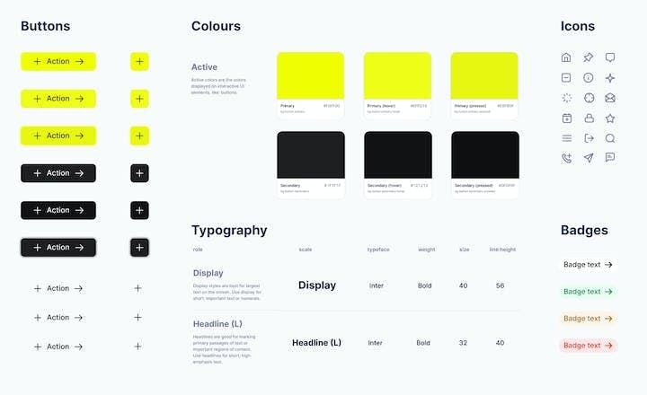
Benefits of a Design System: Why Your Digital Product Needs One
Building a new digital product, such as a web or mobile application, is complex. You need to map user stories - create a simple description of features - then apply them to the developers' scope of work and the app’s design. Discover how a design system can unleash efficiency, consistency, and scalability in your digital product.
9 min. • May 18, 2023
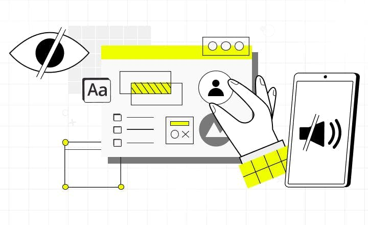
Essential Accessibility: How to Lower the Cost of Building Accessible Web
Most digital products fail to address the rising needs of users with impairments. One of the reasons why business owners don’t decide to implement accessibility standards is a concern that it may raise the cost of web development. Read how to improve web and web app accessibility at a low cost.
15 min. • Jun 6, 2023
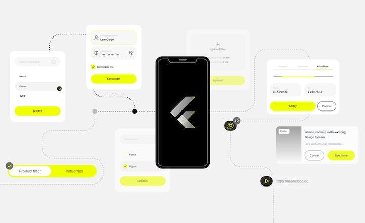
Building a Design System in a Large Flutter App
Flutter is known for its seamless UI/UX features and robust design elements. It allowed us to deliver a unique customer experience in the “CA24 Mobile” banking app. This article shares some of the learnings and pain points behind implementing it in this large project.