
Responsive design in Flutter
What is responsive design in Flutter?
Responsive design in Flutter means building layouts that automatically adapt to different screen sizes, orientations, and form factors such as phones, tablets, and web browsers. A responsive Flutter app remains readable, usable, and visually correct regardless of device dimensions.
Why does it matter in Flutter app development?
Flutter apps often target multiple platforms from a single codebase. Without responsive design:
- UI breaks on tablets and web.
- Content overlaps system UI (notch, status bar).
- Text becomes unreadable on small screens.
Good responsiveness directly impacts usability, accessibility, and perceived quality.
How does it work?
Flutter uses a constraint-based layout system instead of CSS breakpoints. Widgets react to the space they receive at runtime.
The most important tools are:
LayoutBuilder: reacts to parent constraints (recommended)MediaQuery: provides global screen dataSafeArea: protects content from system UI (notches, system bars)- Flexible layout widgets (
Expanded,Flexible,Wrap) - Scrollables (
ListView,GridView)
Example using LayoutBuilder:
LayoutBuilder(
  builder: (context, constraints) {
    if (constraints.maxWidth > 600) {
      return TabletLayout();
    }
    return MobileLayout();
  },
);
Key techniques for responsive layouts
Responsive Flutter UIs are built through composition, not scaling.
- Use
SafeArea: Always wrap top-level content inSafeAreato avoid content being hidden under notches, Dynamic Island, or system navigation bars. - Prefer
LayoutBuilderoverMediaQuery:LayoutBuilderreacts only to its own constraints, making it safer and more efficient when layouts change (keyboard, window resize on web). - Flexible sizing: Avoid fixed widths and heights. Use
Expanded,Flexible, and natural constraints. - Responsive grids: Use
GridView.extentorSliverGridDelegateWithMaxCrossAxisExtentto adapt column count automatically.
Responsive text in Flutter
Text must adapt to screen size and accessibility settings.
Best practices:
- Avoid hardcoded font sizes everywhere.
- Respect system text scaling (
MediaQuery.textScaleFactor). - Use
FittedBoxsparingly (mostly for headlines or icons).
Responsive vs adaptive design
These terms are often confused:
- Responsive: Layout changes based on screen size (e.g. 2 → 4 columns)
- Adaptive: Behavior or UI changes based on platform or input (mouse vs touch, Material vs Cupertino)
Most Flutter apps need both.
Responsive design on Flutter Web
Flutter Web requires extra care:
- Limit maximum content width.
- Avoid very wide text blocks.
- Test browser resizing frequently.
When to use responsive design?
Use responsive design in Flutter when:
- Supporting multiple form factors: tablets, foldables, desktops, or web browsers require layouts that adapt gracefully to varying screen sizes and aspect ratios.
- Building content-heavy screens: dashboards, analytics panels, or news feeds benefit from dynamic layouts that adjust padding, font sizes, and element arrangement.
- Targeting multiple device types: when a single codebase must serve phones, tablets, and web, responsive design ensures consistent usability without duplicating screens.
- Maintaining accessibility and readability: scaling typography, spacing, and interactive elements for larger or smaller screens improves overall UX.
Common Flutter tools for responsive layouts include LayoutBuilder, MediaQuery, Flexible, FractionallySizedBox, SizedBox.expand, and OrientationBuilder (useful when only the screen orientation matters).
When not to overdo it?
Avoid overcomplicating responsiveness when:
- The app is phone-only: simple vertical layouts with scrollable content often do not require multiple breakpoints or complex scaling.
- Screens are simple or single-purpose: static forms, single cards, or minimal UI components usually work fine with default sizing and padding.
- Performance and maintainability are priorities: excessive breakpoints, nested
LayoutBuilders, or constantMediaQuerycalculations can make code harder to maintain and slightly impact performance. - Avoid micro-adjustments using direct calculations: instead of doing
MediaQuery.of(context).size.width * 0.8, a cleaner approach is to wrap content inCenter+ConstrainedBoxwith amaxWidth. This ensures readability on wide screens without overcomplicating the layout.
Common mistakes in Flutter responsive design
- Forgetting
SafeArea. - Using fixed sizes everywhere.
- Designing only for one device.
- Scaling UI instead of changing layout.
Responsive design in Flutter is about working with constraints, not fighting them.
Learn more
9 min. • Jun 1, 2023
Benefits of a Design System: Why Your Digital Product Needs One
Building a new digital product, such as a web or mobile application, is complex. You need to map user stories - create a simple description of features - then apply them to the developers' scope of work and the app’s design. Discover how a design system can unleash efficiency, consistency, and scalability in your digital product.
15 min. • Jun 6, 2023
Building a Design System in a Large Flutter App
Flutter is known for its seamless UI/UX features and robust design elements. It allowed us to deliver a unique customer experience in the “CA24 Mobile” banking app. This article shares some of the learnings and pain points behind implementing it in this large project.
9 min. • May 18, 2023
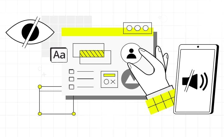
Essential Accessibility: How to Lower the Cost of Building Accessible Web
Most digital products fail to address the rising needs of users with impairments. One of the reasons why business owners don’t decide to implement accessibility standards is a concern that it may raise the cost of web development. Read how to improve web and web app accessibility at a low cost.